

Arket: An Art History App that Emphasizes Environmental and Social Justice.
An art history app that shows the people and cultures connected to the process of making a single work of art. The landing page is an interactive spin wheel that allows the user to scroll through highlighted work. Clicking anywhere on the splash image will bring the user to the main page with information about that image. From there the user can either go back to the spin wheel or continue to explore the site by clicking on other images, author or artist names, or by searching using tags.
Art works include materials used to make the piece, cultural significance, and impact the piece has had on other artists and works.
Materials include environmental impact of farming the material, cultural significance, global trade, and its common uses.

The Problem
Many working adults and full-time students don’t have time to visit art galleries and museums. In addition, visiting cultural institutions can be intimidating and are not always accessible.
Verified research on individual art pieces tends to be locked behind scholarly journals and other paid databases.

The Solution
Increase access for the public to fine art; provide an educational tool and database; target audiences are defined by time and financial constraints.

The Goal
To increase the effectiveness of multicultural bridges through empathy and portrayal of folk and fine art in the words of the original artists and communities.
The inspiration for Arket came from a lifetime of watching people interact with art and art history.
My background helped form my values…

Growing up in the Boston area with a folk arts background
… which inspired me to find ways to make art education more accessible.

Peabody Essex Museum

Students

Artists and Craftspeople

Educators

Harvard Museum of Comparative Zoology
Public School Education & access to Cultural Institutions

College courses in Museum Studies & access to Federal Historic Preservations
… and impacted where I’ve worked…

National Park Service
Museums use technology to give audiences a way to interact with exhibits.
I've worked at the Peabody Essex Museum (PEM), The Harvard Museum of Comparative Zoology (MCZ), and the National Park Service (NPS-SAMA), and taken college classes in museum management. The rule for museums to survive in the twenty first century is consistent across the board - if you want an audience, you need interaction.
Around 2017 the PEM brought in what is now an ongoing exhibit, "All the Flowers Are for Me" a giant installation created by Pakistani-American artist Anila Quayyum Agha. It has been the scene for everything from yoga classes to an engagement. The National Park Service keeps a pair of movies on loop that give a brief overview of early Puritan settlers (full disclosure: they interview a favorite professor of mine in one of the films). The broader Harvard Museum network utilizes a mixture of tactile and technological tools to give audiences new ways to interact with their collection.
This is my primary inspiration behind the design of Arket. I took this idea of interacting with each piece, of digging into it to find out what it's made of, and used that as the core of my design.

Personas helped me to keep in mind unique difficulties individual users might possess and barriers to entry they might experience.


“I want to give people the opportunity to see beautiful things while protecting the place those things come from.”
“What homework, miss?”
“You don’t know who these kids will turn out to be someday, so your impact matters today.”

“Environmental justice matters for everyone. I hope in some tiny way every stitch I sew makes the world a little better.”
-
Family: Adopted Child, Cat
Occupation: High School Teacher
Age: 48
Education: MAT
Hometown: Boston, MA
Problem: Arwen Connolly is a high school teacher who needs to see specific information about paintings so she can connect the information with her class curriculum.
Goals: To give real-world context to what she is teaching in the classroom. To teach her students the importance of respecting other cultures while learning about global history. To be up-to-date with ways for students to learn, so using technology in addition to outside experiences is important to her.
Frustrations: Communicating nuanced information to her diverse group of multiethnic, multilingual students. Some of her students are hearing, vision, or other ability impaired, and might not be able to read. Any software or app she assigns needs to be accessible. Any technology she is using must be intuitive for teenagers.
-
Family: Parents, 3 Siblings,
Occupation: Student
Age: 15
Education: HS
Hometown: Lynn, MA
Problem: Felicia has a history assignment coming up in which she needs to present the impact of colonization on a particular culture during a specific year. As a knitter she wants to focus on the fiber arts and dyes of the group she is researching.
Goals: Her mother and grandmother regularly share their family histories around the dinner table. In that spirit, Felicia wants to show how both positive and negative impacts can be multigenerational.
Frustrations: Information is abundant but unreliable and often comes with an agenda.
-
Family: Wife, 2 Children
Occupation: Photographer
Age: 27
Education: BA
Hometown: Tampa, FL
Problem: Cultural authenticity and authorship is important to Jules Pierre. As he photographs materials he wants to read about them from authors for whom the material had historic and familial value.
Goals: Jules Pierre is a professional photographer who wants to give contemporary context to materials by photographing them in their natural state.
Frustrations: Jules Pierre is specifically interested in the intersection of cultural history and contemporary ecological impact. He is looking for a place where he can display is photographs alongside scholarship that brings regional history to light.
-
Family: Spouse, Guinea Pig
Occupation: Fiber Artist
Age: 43
Education: MFA
Hometown: Portland, OR
Problem: TabBee is a fiber artist who travels the world going to different conventions to display their designs and find new clients.
Goals: To learn more about the cultural and environmental impact of the materials they use to design their costumes.
Frustrations: As a person with ADHD, they tend to fall down rabbit holes and lose where they’ve saved information. They want a single place where they can both research art and save information for later.
I looked to other organizations for inspiration on effective ways to engage audiences.


History Of Art
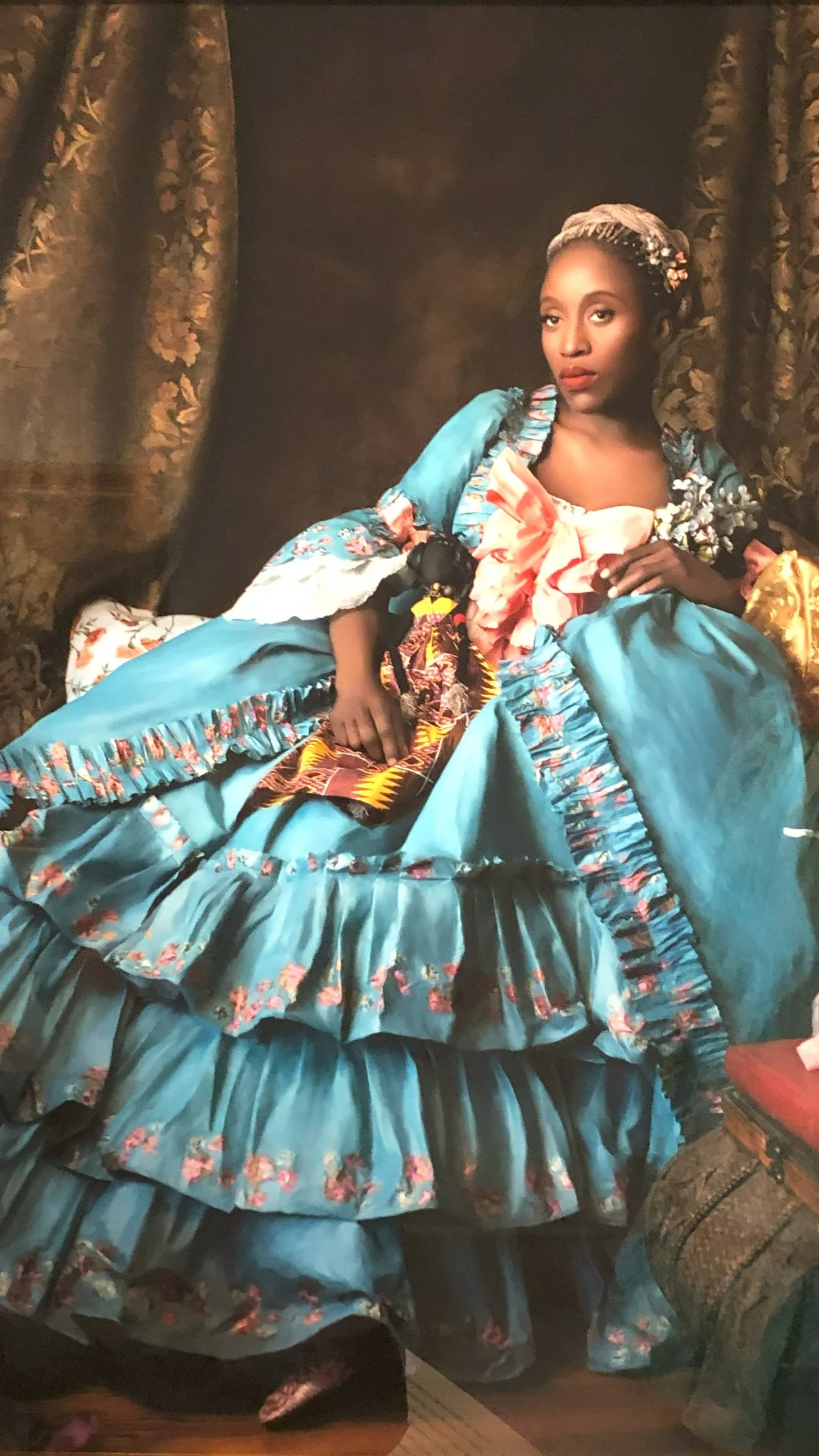
The main page splash image is dramatic and beautiful. You click on the image in order to begin navigating through the rest on the sight.
Tumblr
Expansive image collection that allows for context by the original poster and encourages community engagement through likes and comments.
Wikipedia
Content links connect articles and enables an organic journey through a maze of interconnected information.
A usability study showed that my prototype was intuitive but needed some tweaking.
Key Questions:
Does it work?
Is it pretty?
Study Participants:
2 Female-Identifying
4 Male Identifying
4+ physical and cognitive disabilities represented
Users asked to perform tasks on low-fidelity prototype
KPIs:
Task Success Rate
Navigation vs. Search

“Where is the home button?”
- 3 out of 5 participants either tried to use the back button to get to the home page or had trouble finding the home page.
- Most users expressed the same confusion.
UPDATE: A new floating home button was added to the bottom of the screen


“I almost wonder if there’d be a top-level button for favorites. ”
- 3 out of 5 participants wanted to quickly be able to access their favorites list.
UPDATE: The new favorites icon floats on the page so that it will always be accessible.

The main idea behind the landing page stayed throughout the design process, but was adjusted with input from designers and users.

I used red stars to indicate what I wanted to carry forward in the next design iteration.

I wanted the landing page to be an invitation to the user to explore, so I experimented with different types of navigation to try to capture that.

“You made this really clear design that works really well [the bottom scroll wheel]. Why didn’t you use it for the final prototype?”

After receiving feedback I went back to my initial design idea and created something that both worked within the confines of the technology and satisfied my users.
My final designs are an expression of the value I give to accessible education and the importance of a nuanced look at cultural and environmental impact.
I wanted to build something that looked and felt luxurious to use, contains beautiful imagery, and runs smooth as warm butter in a hot pan. I don't want people to feel hung up trying to find something, but rather to give in to the sense of excitement and chase treasure down a rabbit hole. I want to give the same sense I get when I visit the Stewart-Gardner museum in Boston. You're not walking through dauntingly long marble halls, you're visiting someone's private space. It's intimate, like a parlor. You could almost turn around and Isabella is asking if you'd like a cup of tea while you sit and gaze at medieval tapestries.


If I were to continue working on this project, I would add tools for educators and increase accessibility.
Change the logo - "Why does your logo look like a piece of medical equipment?" is some of the feedback I received.
Colorblind and low-vision filter icons available next to each image, preferably near where the "expand image" icon is located in order to normalize their use and make them easy to find.
Explore other accessibility options including the validity of dyslexic type.
Educator portal - key for this to be useful in the education section and would include such QOL as a way to add assignments, extend deadlines, custom-set grading tiers based on lateness, and add custom names and pronouns for students.
Online Shop - connect users with a means to purchase materials found in art pieces that are gathered in a way that reduces environmental impact and improves the wellbeing of local communities. Highlight segment under materials showing "communities and people today" by providing additional information on family and community run businesses, allowing users to have a direct impact.
I re-learned to both trust my gut and not make assumptions.
There were moments in this design (ex. the spinning wheel) when I felt I had a good idea but somewhere in the last stretch found myself second-guessing the design. I even went so far as to scrap the idea to something that ended up being less effective but felt more inline with what I had seen in other places in the industry (ex. carousel icon). What I learned was it’s better to finish it and run it by others than to stop midway through and switch gears.
Chat with users - often. Through out the course of this design I kept in conversation with hobbyists, artists, educators, and students. I didn’t necessarily discuss the design I was working on, but I did take the time to just sit and listen to the things they loved and what was frustrating to them. Keeping an ear to the ground is one of my superpowers, and I was able to take what I heard and incorporate it into the design (ex. the section on materials used for making pieces of art).
This project was part of a Google/Coursera course to learn how to use Figma. I started this project with no knowledge on the program and ended with the final prototype for Arket.